
cradle moon conservancy
A minimalist visual identity and environmental wayfinding system rooted in the lunar cycles of the South African wild.
Sector: Hospitality & Travel | Civic & Public
Discipline: Brand Identity | Signage & Environmental Graphics
-
Nestled within a 1600-hectare conservancy in Gauteng, Cradle Moon is a sanctuary defined by its raw natural beauty and architectural heritage. The challenge was to create a visual identity that felt as though it belonged to the landscape, avoiding the over-polished aesthetic of traditional luxury resorts in favor of something more primal, honest and connected to the earth.
The resulting system is a study in restraint, moving away from literal "nature" tropes to focus on the celestial and geometric rhythms that govern the conservancy.
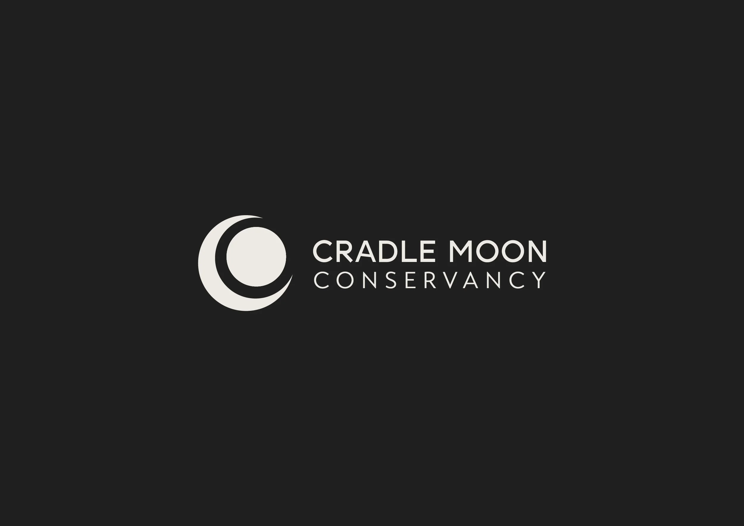
The Lunar Geometry
The core of the identity is a minimalist icon system inspired by the phases of the moon and the silhouette of the horizon. By utilizing clean, geometric arcs and sharp lines, the logo reflects both the "Cradle" (the valley and dam) and the "Moon" (the guiding light of the night sky). This symbology creates a timeless mark that functions equally well as a premium letterhead or a physical brand burned into timber.
Materiality and Environment
The visual language was developed with physical application in mind. In a conservancy setting, the brand exists primarily in the wild.
Monochrome Palette: A strict black-and-white palette was chosen to provide maximum contrast against the golden highveld grasses and deep green bush, ensuring the brand remains visible without competing with the natural colors of the environment.
Wayfinding: The signage system utilizes the geometric language of the brand to guide visitors through the trails, emphasizing a "leave no trace" philosophy through subtle, integrated design.
Typographic Clarity
The typography mirrors the conservancy's architecture: sturdy, functional and unpretentious. The use of a high-legibility sans-serif ensures that the brand communicates clearly across vast distances, whether on entry gate security or restaurant menus. The layout strategy emphasizes negative space, echoing the expansive, quiet nature of the conservancy itself.
By stripping the brand down to its most essential geometric forms, the new identity positions Cradle Moon as a sophisticated, modern retreat that honours the ancient stillness of its location.